DRAFT 1
In my re-creation of this interactive work, I was not just copying the original, but thinking deeper and deeper throughout the process. Each step made me reflect on how to make the interactive elements fit better with the visuals, especially in the part where the sound interacts with the picture, making sure that each element connects smoothly and produces the desired response.
The first difficulty was to find the right connection between the visuals and the sound. The movement path of each visual element and the frequency of the audio must be precisely synchronised to create a harmonious interaction. When using a virtual modular synthesiser, the relationship between the notes and the images needed to be finely tuned to ensure that the two could seamlessly flow together to create a rhythmic interactive experience.
The biggest technical challenge was undoubtedly learning how to achieve these effects through node programming. Mastering the functions of the different nodes and how they connect to each other is a complex and challenging process in TouchDesigner. Each node has a different purpose, and how to combine them into an interactive system that responds to external inputs was a challenge I had to overcome.
In subsequent attempts, I realised that even a simple audio signal cannot be directly translated into a visual effect. When I tried to convert an audio signal into an image, I realised that each visual element had different layers and details. These details need to be constantly adjusted, layered and mirrored to ensure that the visuals are unified and coordinated. This iterative process made me think more deeply about the connectivity between each detail and how they work together.
DRAFT 2
In today’s world, the line between interactive and graphic design is becoming increasingly blurred. Traditional graphic design focuses on static visuals, while interactive design is all about data-driven, dynamic experiences. With tools like TouchDesigner, we can use sound to influence visual layouts, exploring new relationships between sound, imagery, and interactive interfaces.
How Does Sound Influence Interaction
During my second-week experiment, I realized that sound isn’t just something we hear—it can also be transformed into data that drives visual changes. For example, the bouncing of a basketball, the sound of a badminton racket hitting a shuttlecock, or the rhythmic steps of a runner can all be analyzed into different frequencies and amplitudes. These sound properties can then be mapped to visual elements, making the layout more fluid. Fonts, colors, and even the arrangement of images can all shift dynamically based on sound characteristics.
Traditional graphic design follows grid systems and composition rules, but through interactive experiments, I found that these principles can become more flexible with sound or user input. For instance, text spacing can expand or contract based on pitch, and page elements can move rhythmically in response to beats. This approach makes graphic design more than just a static visual—it becomes interactive and dynamic.
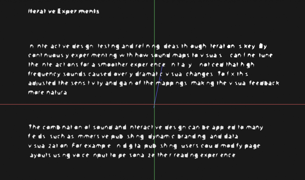
Iterative Experiments
In interactive design, testing and refining ideas through iteration is key. By continuously experimenting with how sound maps to visuals, I can fine-tune the interactions for a smoother experience. Initially, I noticed that high-frequency sounds caused overly dramatic visual changes. To fix this, I adjusted the sensitivity and gain of the mappings, making the visual feedback more natural.
The combination of sound and interactive design can be applied to many fields, such as immersive publishing, dynamic branding, and data visualization. For example, in digital publishing, users could modify page layouts using voice input to personalize their reading experience.
DRAFT 3

*Aleessandro, (2012) Post-Digital Print: The Mutation of Publishing since 1894.

Leave a Reply